Meta-Player Skinning
Skinning
With a skin, the look and effects of the buttons can be changed. To use
a skin, set the skin property of the options object to a skin object,
or define MistSkins.skin_name elsewhere and set it to the name of the
skin. MistServer has two predefined skins: default (the default skin
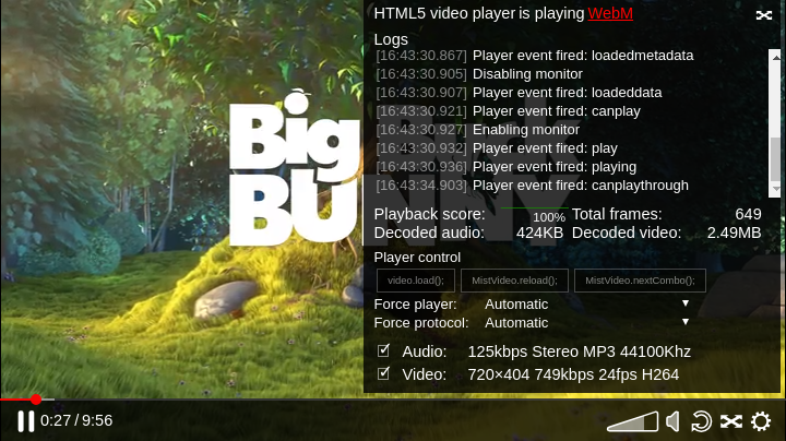
intended for production) and dev (with additional information and
controls aimed at developers).
Skin definition
A skin can be defined directly in the options object passed to
MistPlay, or elsewhere by setting
var MistSkins.skin_name after the meta-player's code,
player.js, has been loaded.
A skin is made up of several components, which are defined in the skin definition's properties:
-
colorsNames of color variables that can be used to quickly modify the meta-player's color scheme. -
cssCSS rules that determine how the various elements are displayed, referencing the color scheme. -
iconsThese are SVG icons that can be used by the various blueprints. They are marked with classes so that their appearance is determined by the CSS rules and colors. -
blueprintsA blueprint is a part of the user interface, such as a play button or progress bar. -
structureThe structure defines the layout of the various blueprints creating the meta-player's user interface.
inherit
If this property is present and is a skin name, the properties of the given skin will be extended with the current skin definition. If omitted, the default skin will be extended.
colors
If this property is present, the inherited skin's color object will be extended with this one.
The colors defined here are used in the CSS files pointed to in the
css property. The default skin uses these listed below.
accent
An accent color for things meant to catch the user's eye, like the current progress bar.
fill
The fill color for icons that use the fill class.
semiFill
The fill color for icons that use the semiFill class.
stroke
The text color and stroke color for icons.
strokeWidth
The stroke width for icons.
background
The background color of the control bar.
progressBackground
The background color of the progress bar.
css
If this property is present, the inherited skin's css object will be extended with this one. It should be an object that contains urls to css files that control the display and layout of the meta-player's DOM elements.
The object's keys are only used to allow selective overwriting. The
values should be urls to special css files. The default skin uses the
key skin for its css.
The css file is allowed to contain variables marked with a $-sign,
pointing to colors named in the color object. For example,
.mistvideo-controls { background-color: $accent; } will set the
controls' background to the accent color.
The css rules will be prepended with the meta-player instance's unique id, so that they won't affect other meta-player instances which may use other skins.
icons
If this property is present, the inherited skin's icon object will be extended with this one. It should be an object that contains definitions for an svg.
Each key should be an icon name, and each value should be an object, with these properties:
size
This should be object, with width and height properties set to a
number, indicating the height and width of the icon viewbox. If the
width and height are the same, just the number value may be used as a
shorthand. This isn't necessarily the size the icon will have once on
the web page.
svg
This should be a string containing the contents of the svg, or a function returning that string. If you would like the css and/or color rules to affect the appearance of the icon, these properties should not be defined inline, but through the use of classes. These are the classes currently being used by the default skin:
-
fillThis svg element should be filled with the defined fill color. -
semiFillThis svg element should be filled with the defined semiFill color. -
strokeThis svg element should have a stroke with the defined stroke color and width. -
toggleIf the icon has the classoff, elements and children of elements with this class that have the classfillorsemiFillwill have their fill set tonone. -
spinThis svg element should have a spinning animation.
Constructing the icon element
Calling the MistVideo.skin.icons.build(type,size,options)
method will return the icon as a DOM element.
type should be a string, with the name of the icon.
size should be an object, containing the properties width and
height set to a number: the desired size of the icon in pixels. A
number may be used as shorthand if its width and height are equal. If
only one of width and height is specified, the other will be
calculated automatically using the icon's aspect ratio. If omitted, a
value of 22 is used.
If the svg property of the icon object is a function, options is
passed to it as its parameter.
structure
If this property is present, the inherited skin's structure object will
be extended with this one. It should be an object that defines the
layout of the various meta-player's elements, defined in the
blueprints property.
For convenience, the structure option is split into properties that can be overwritten separately. Each of these properties, if defined, should contain a structure object.
-
mainThe main structure that contains the video element and controls. -
videocontainerThis structure contains the video element. If for example you'd like to add a logo on top of the video, this would be the best place to do so. -
controlsThis structure contains the controls of the meta-player. -
submenuThis structure contains a popup menu that is used in thecontrolsstructure. -
placeholderThis structure contains elements returned by the placeholder, loading and error blueprints. It is shown after the skin is loaded but before the player is initialized. -
secondaryVideoThis structure contains a video element and controls, intended to be used for picture-in-picture mode.
Structure object syntax
A structure object should either be an object, or a function that
returns a structure object. The function can reference the MistVideo
object as this.
The structure object may contain these keys:
-
typeIf this property is set and the name of a blueprint, that blueprint is constructed with the current structure as its parameter. Please refer to blueprints for the possible types and their options. -
classesIf this property is set, it should be an array of classes that will be added to the DOM element. -
titleIf this property is set, the DOM element's title attribute is set to it. -
childrenIf this property is set, it should be an array of structure objects that will be appended as children of the DOM element. -
styleIf this property is set, it should be an object containing style properties and their desired values that will be applied directly on the DOM element. -
ifIf this property is set, it should be a function that will be passed the current structure as its parameter. When this function returns true, the structure object specified by thethenkey is used, otherwise, it will use the structure object specified by theelsekey.
Constructing a structure
Calling the MistVideo.UI.buildStructure(structure) method
will return the structure as a DOM element.
structure should be a structure object.
blueprints
If this property is present, the inherited skin's blueprints object will be extended with this one. It should be an object that defines how the various elements should be constructed and how they should function.
The blueprint function is given the current structure as its parameter.
It can reference the MistVideo object as this. It should
return either a DOM element or false if nothing should be
added to the DOM tree.
All elements returned by blueprint functions will be given a class of
their name, prefixed with mistvideo-, for example:
.mistvideo-container.
Listed below are the blueprints that are defined in the default skin.
container
Returns an empty div.
hoverWindow
Returns a DOM element containing a button and a window that is shown when the button or window is hovered over.
To use it, define these properties on the structure object:
-
buttonShould be a structure object of the element the user should hover over to show the window. -
windowShould be a structure object of the window that should be shown. -
modeShould be the string"pos"to enable absolute positioning of the window. More modes may be supported at a later time. -
transitionShould be an object with the properties listed below. Each should contain a string of CSS rules that define the position of the item.-
showWill be used as CSS rules for the window when the button is hovered over. -
hideWill be used as CSS rules for the window when the button is not hovered over. -
viewboxWill be used as CSS rules for the window viewbox. Parts of the window that fall outside of the viewbox will be hidden.
-
Example
var structure = {
  type: "hoverWindow",
  button: {type: "settings"},
  window: {type: "submenu"},
  mode: "pos",
  transition: {
    hide: "right: -1000px; bottom: 44px;",
    show: "right: 5px;",
    viewport: "right: 0; left: 0; bottom: 0; top: -1000px"
  }
};
This structure object will create a settings button and a window containing the submenu structure. When the button is not hovered over, the window will be hidden from view on the right side of the player container. When the button is activated the window is shown with a margin of 5 pixels from the right side of the container. If the window is taller than the container, this part will be visible. Overflow in other directions is hidden from view.
video
Returns the video DOM element. It also improves autoplay behaviour (if the browser blocks autoplay, mutes the video and retries), hides the cursor when it is not moved, and disables right clicking on the element.
videocontainer
Returns the elements defined by the videocontainer structure.
secondaryVideo
Returns the elements defined by the secondaryVideo structure. Starts up
a secondary meta-player instance playing the same stream. Define the
options property on the structure object to pass those options to the
secondary meta-player. It also corrects for desync with the main video.
The secondary video will be muted.
Example
structure.videocontainer = {
  type: "container",
  children: [
    {type: "video"},
    {
      type: "secondaryVideo",
      options: {
        setTracks: {
          video: 3
        }
      }
    }
  ]
};
If the video container is replaced with this structure, a secondary video will be added to the meta-player instance. The secondary video will play the video track with an identifyer of 3.
switchVideo
Returns a button that switches the main and secundary video it is attached to.
controls
Returns the elements defined by the controls structure.
submenu
Returns the elements defined by the controls structure.
progress
Returns a progress bar, indicating the current playback position, buffered sections, and allowing seeking. When the stream being played is live, the progress bar will indicate the seek window.
play
Returns a button with a pause icon when the stream is playing and a play icon when the stream is paused. It also asks the video player to play when the video element is double clicked.
speaker
Returns a button with a speaker icon. When the button is clicked, the muted state is toggled.
volume
Returns a button with a volume icon. When the button is clicked or dragged on, the video player's volume is set to the level indicated.
The volume level is scaled quadratically: clicking at 50% will set the volume to 0.25;
currentTime
Returns a div that display the current video time.
totalTime
Retuns a div that displays the duration of the video. If the stream is
live, it will receive the class live and it will display the text
"live".
playername
Returns a div that displays the name of the player.
mimetype
Returns a link to the stream source and displays the source's mime type.
logo
Returns an element.
Set the element property to a DOM element to use that, or set the
src property to an url to an image.
settings
Returns the settings icon.
loop
Returns a button that toggles the loop state or false if the stream is live.
fullscreen
Returns a button that toggles fullscreen mode.
tracks
Returns an interface that displays the tracks and allows track switching if multiple tracks are available.
text
Returns a span with the text specified with the text property.
placeholder
Returns a div with the size of the stream. If a poster has been configured, it is used as a background image.
timeout
Returns a countdown icon. The following properties can be used:
-
delayShould be omitted or set to a number. Indicates the amount of seconds after which the function is executed. If omitted, the delay is set to 5 seconds. -
functionShould be a function that is executed after the delay has passed.
loading
Returns a div containing a rotating loading icon. It is shown when something is loading in the background and the video is not playing.
error
Returns a div that displays an error when applicable. It adds the MistVideo.showError() and MistVideo.clearError() functions described in section Meta-Player api .
tooltip
Returns a div that displays a tooltip.
The returned element has these methods:
-
setText(text)sets the displayed text to the string provided. -
setPos(position)sets the tooltip position.positionshould be an object containing the CSS position properties (top,bottom,leftandright) set to their desired value. Any position properties that should be set toautocan be omitted. -
triangle.setMode(primary,secondary)sets the position of the tooltip tip.primaryandsecondaryshould be strings containing one of the CSS position property names ("top","bottom","left"and"right"). The primary direction dictates the side on which the tip appears. The secondary direction dictates its alignment.
Example
var tooltip = MistVideo.UI.buildStructure({type:"tooltip"});
tooltip.setText("Hello world");
tooltip.triangle.setMode("bottom","left");

//apply meta player css to the document body
var uid = false;
MistVideo.container.classList.forEach(function(a){
  if (a.indexOf("uid") == 0) { uid = a; }
});
if (uid) { document.body.classList.add(uid); }

document.body.appendChild(tooltip);
document.body.addEventListener("mousemove",function(e){
  var pos = {bottom: this.clientHeight - e.clientY + 10};
  var leftPercentage = e.clientX / this.clientWidth * 100;
  if (leftPercentage > 50) {
    pos.right = (100 - leftPercentage)+"%";
    tooltip.triangle.setMode("bottom","right");
  }
  else {
    pos.left = leftPercentage+"%";
    tooltip.triangle.setMode("bottom","left");
  }
  tooltip.setPos(pos);
});
This code creates a tooltip and appends it to the body. The tooltip will follow the cursor around. If the cursor is on the left side of the screen the tooltip appears to the right of the cursor. If the cursor is on the right side of the screen the tooltip appears to the left of the cursor.
button
Returns a button element.
The following structure object properties can be used:
-
labelThe text that should be displayed on the button. -
onclickThe function that should be executed when the button is clicked. -
delayIf specified, this should be a number indicating the number of seconds after which theonclickfunction should be executed. Atimeouticon is prepended on the button.
Examples
Other colors
The following skin definition changes the default skin's color scheme.
MistSkins.white = {colors:{
  fill: "rgba(34,136,187,1)",
  semiFill: "rgba(34,136,187,0.5)",
  stroke: "#000",
  background: "#fff",
  progressBackground: "rgba(34,136,187)",
  accent: "cyan"
}};
Disabling a blueprint
The following skin definition disables the progress bar.
MistSkins.noprogress = {
  blueprints: {
    progress: function(){ return false; }
  }
};
Skin inheritance
The following code adds a random accent color to the developers' skin.
function getRandomFromArray(array) {
  return array[Math.floor(Math.random() * array.length)];
}

//create an element to hold the meta-player
var c = document.createElement("div");
document.body.appendChild(c);

//build the meta-player
mistPlay("stream",{
  target: c,
  skin:{
    inherit: "dev",
    colors: {
      accent: getRandomFromArray(["red","yellow","cyan"])
    }
  }
});
Using logos
The following code constructs a meta player instance with a static logo and a dynamic banner.
//pre-create an image element that will be passed on to the meta-player
var banner_bottom = document.createElement("img");

//some pre-defined sources for the banner
var banner_srcs = [
  "my_banner1.png",
  "my_banner2.png",
  "my_banner3.png",
  "my_banner4.png"
];
//loop over the banners
var i = 0;
function next_banner() {
  banner_bottom.src = banner_srcs[i];
  i++;
  if (i >= banner_srcs.length) { i = 0; }
}
setInterval(function(){
  next_banner();
},30e3);
next_banner();

//create an element to hold the meta-player
var c = document.createElement("div");
document.body.appendChild(c);

//build the meta-player
mistPlay(streamname,{
  target: c,
  skin:{structure:{
    videocontainer:{
      type: "container",
      children: [
        {type: "video"},
        {
          type: "logo",
          src: "my_logo.svg",                             //the logo blueprint can be given an image url
          style: {
            position: "absolute",
            width: "10%",
            top: "1em",
            right: "1em",
            filter: "drop-shadow(1px 1px 2px black)",
          }
        },
        {
          type: "logo",
          element: banner_bottom,                          //..or a DOM element
          style: {
            position: "absolute",
            width: "80%",
            maxHeight: "15%",
            objectFit: "contain",
            bottom: "37px",
            left: 0,
            right: 0,
            filter: "drop-shadow(1px 1px 2px black)",
            margin: "0 auto"
          }
        }
      ]
    }
  }}
});